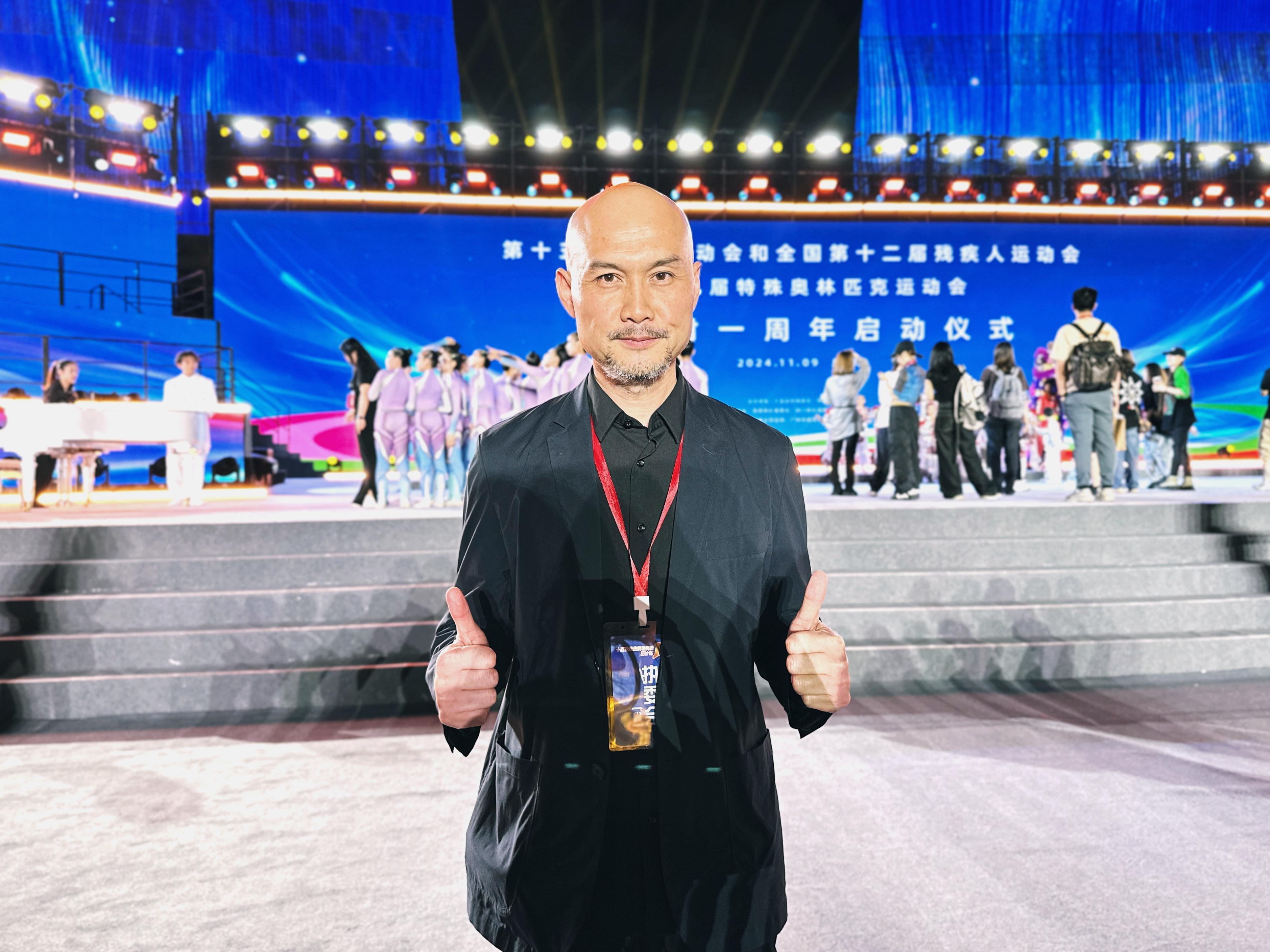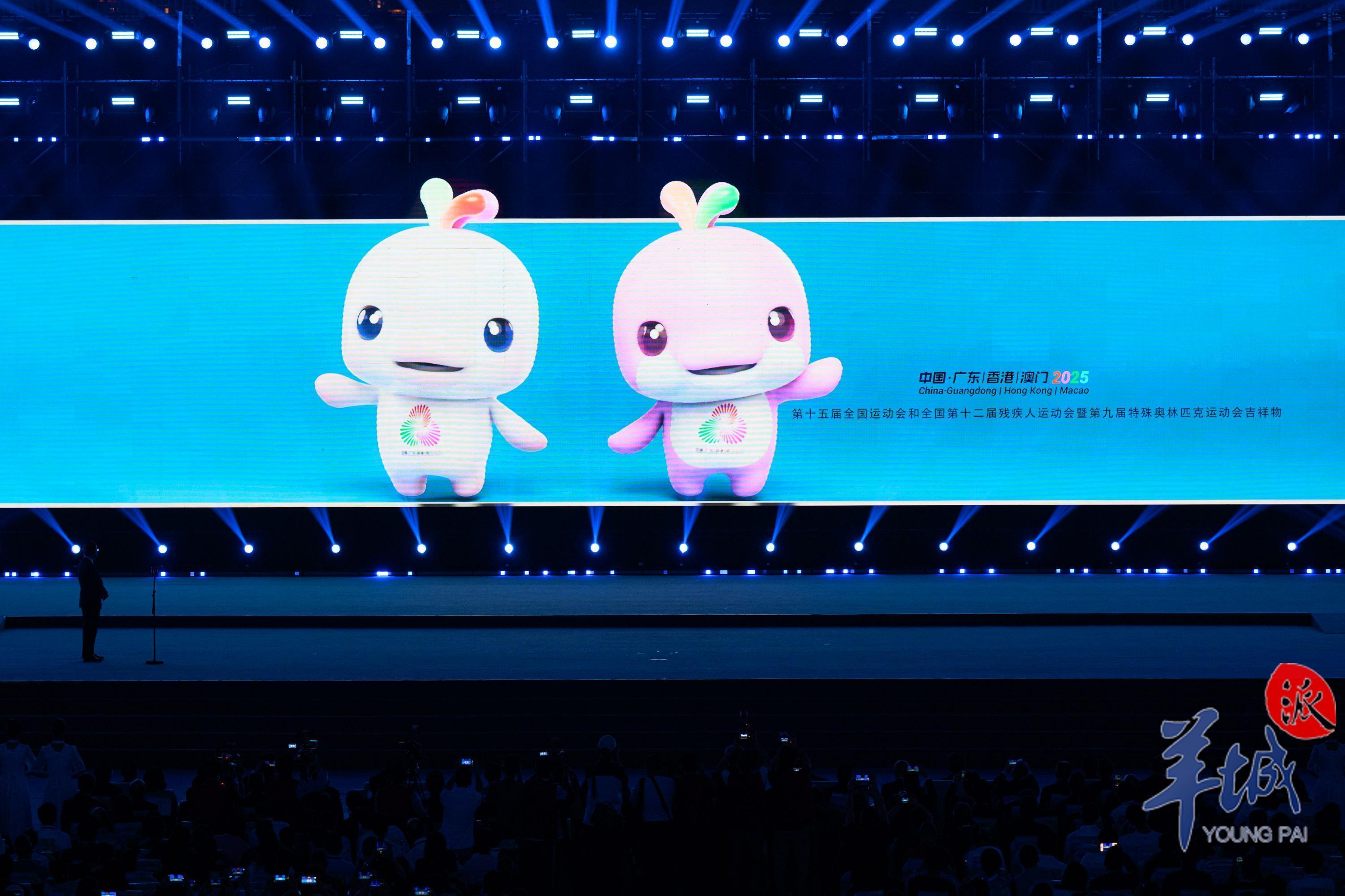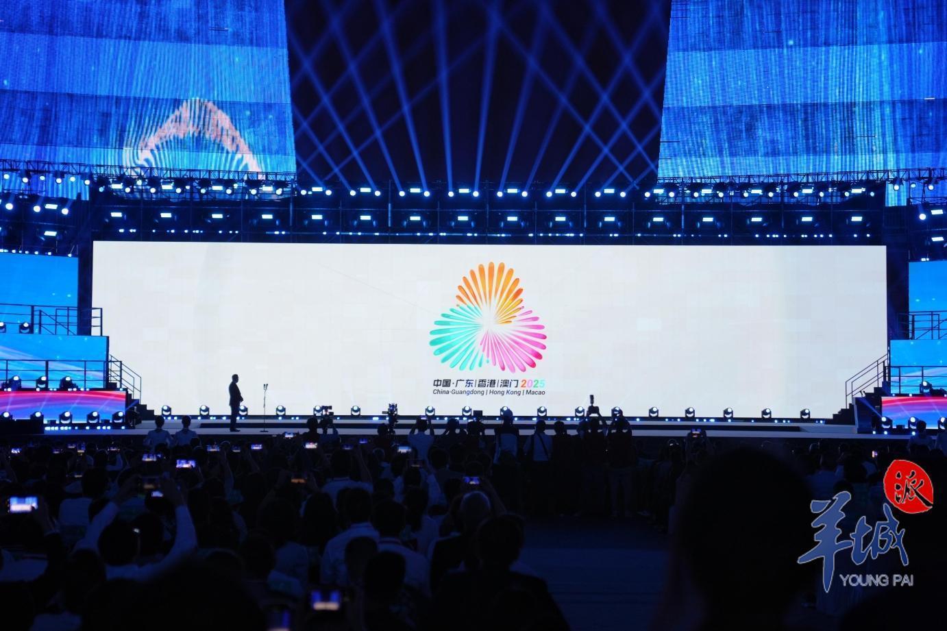
At the one-year countdown launch event for the 15th National Games and the National Games for Persons with Disabilities, and the National Special Olympic Games held on November 9th, the emblems and mascots for the 15th National Games and the National Special Olympic Games were unveiled. The designs were created by the team led by Liu Pingyun, who was also the chief designer behind the Beijing 2022 Winter Olympics mascot, Bing Dwen Dwen. The team completed the design within five months. One of the highlights of the design is the choice of the mascot, which is based on the Chinese white dolphin, a unique species that best represents the Greater Bay Area.

To make the mascot more impressive, the team incorporated three small water droplets on the head of the mascot, each representing a different element: the red of the kapok flower from Guangdong, the purple of the Bauhinia flower from Hong Kong, and the green of the lotus flower from Macao. The two mascots are named "Xi Yangyang" and "Le Rongrong", and they will soon be made into products. Liu hopes that through variations in materials during production, the mascots will better reflect the spirit of the times and become beloved by everyone.

The design for the emblem went smoothly and centered around the themes of "unity, blossoming, and carnival." The three flowers in the emblem represent petals that come together in harmony, symbolizing unity and shared joy in the carnival. This reflects that the event is not only a display of athletes' passion but also a grand celebration involving the participation of the entire nation.

Overall, the designs of the emblems and mascots are both creative and meaningful. They reflect the unique characteristics of the Greater Bay Area while also showcasing the enthusiasm for nationwide participation. Liu's team completed this challenging task in a short time, demonstrating their strong design capabilities and professionalism. In the future, "Xi Yangyang" and "Le Rongrong" will become key symbols of the Games, leading everyone to join in this grand carnival.
Source :Lingnan on the Cloud
十五运和残特奥会吉祥物和会徽是怎样创作出来的?
在11月9日举行的全国运动会和残疾人运动会暨特殊奥林匹克运动会倒计时一周年启动仪式上,十五运会和残特奥会发布了其会徽和吉祥物。这些重要元素的设计出自刘平云团队之手,他曾是北京2022年冬奥会吉祥物冰墩墩的设计总执行。该团队在短短不到5个月的时间内完成了设计任务。此次设计的亮点之一是吉祥物的选择,刘平云团队最终聚焦在中华白海豚上,这是最能代表湾区的一个特殊物种。
为了让吉祥物更具记忆点,团队在吉祥物头顶设计了三朵小水花的元素,分别代表了广东的木棉红、香港紫荆花的紫和澳门莲花的绿色。这两个吉祥物被命名为“喜洋洋”和“乐融融”,接下来将进入产品生产阶段。刘平云希望在生产过程中,通过材质的变化,使吉祥物更加凸显时代性,受到大家的喜爱。
会徽的设计过程相对顺利,主要围绕“同心、绽放、嘉年华”的主题展开。会徽中的三朵花是同心的花瓣,寓意同心同德,全民欢庆嘉年华。这表达了运动会不仅是运动员激情的绽放,更是全民参与的一个盛会。
总的来说,十五运会和残特奥会的会徽和吉祥物设计富有创意和深意,既体现了粤港澳大湾区的特色,又展现了全民参与的热情。刘平云团队在短时间内完成了这一艰巨任务,展现了其强大的设计能力和专业素养。未来,“喜洋洋”和“乐融融”将成为运动会的重要象征,引领着全民共同参与到这场盛大的嘉年华中来。
文 | 记者 苏荇 胡广欣 柴智
图 | 记者 周巍 钟振彬
译 | 林佳岱
审 | 郑圣浩
-
The 2024 Global Investment Promotion Conference for the GBA attracts 2.26 trillion yuan in investment
2024-11-09 20:26:24 -
Reflections on the flood disaster in Spain
2024-11-09 20:26:34 -
The highly anticipated J-35A stealth fighter makes its grand debut!
2024-11-08 22:14:18 -
Guangdong lists top 100 foreign-invested enterprises
2024-11-08 22:14:24


