


On November 9th, the 15th National Games opened at the Guangdong Olympic Sports Center. The opening ceremony ticket, designed by Guangdong Advertising Group Co., Ltd. (GIMC), made its stunning debut at the same time. Guided by the core concept of "integrating tradition and embracing the future", it serves as a "cultural calling card" for conveying the spirit of the Games and showcasing regional characteristics.

As the first National Games jointly hosted by Guangdong, Hong Kong and Macao, this edition carries exceptional significance. The ticket design went through dozens of iterations before two designs, titled "Leaping Motion" and "Pursuing Dreams", emerged victorious. The face of the ticket features a dominant "Chinese Red" palette and takes the shape of the "red packet", a cultural symbol shared across the Guangdong-Hong Kong-Macao Greater Bay Area (GBA). The design not only enriches the festive ambience but also evokes the warmth of Lingnan's festival traditions, deepening cultural identity.

Breaking from the traditional horizontal format, the design innovatively adopts a vertical layout, aligning with the visual habits of the vertical-screen era and facilitating digital media dissemination and interaction. The "Leaping Motion" version centers on a bird's-eye view of the Guangdong Olympic Sports Center stadium, with the roof form echoing the theme of "Leaping Greater Bay Area". The fifteen golden streaming lines correspond to the edition number of the Games, resembling track lanes that symbolize the spirit of struggle. The "Pursuing Dreams" version outlines the silhouette of the Tianhe Sports Center, highlighting Guangzhou's enduring sports heritage and its close ties with the National Games.
To enhance its collectible value, the ticket incorporates a range of international-standard anti-counterfeiting technologies, such as miniature micro-engraved patterns, invisible fluorescence, and intaglio printing. The central typography is embossed with a distinct tactile texture, and under ultraviolet light, the emblem reveals tri-color fluorescence along with the mascots' images. Within this small ticket lies craftsmanship and technological innovation, making it a unique medium that embodies the cultural integration of GBA and the spirit of sport.
一张十五运会开幕式门票,蕴藏着哪些创新巧思和文化内涵?
11月9日,十五运会在广东奥林匹克体育中心开幕,由省广集团操刀设计的开幕式门票同步惊艳亮相,以“融汇传统、面向未来”为核心理念,成为传递赛会精神、彰显地域气质的“文化名片”。
作为粤港澳三地首次联合承办的全运会,本届赛事意义非凡。门票设计历经数十轮打磨,“跃动”与“逐梦”两套方案最终胜出。票面以大面积“中国红”渲染,采用粤港澳共同文化符号“利是封”形态,既强化盛典氛围,更传递岭南人间烟火的温暖,深化文化认同。
设计突破传统横版制式,创新采用立式布局,既契合竖屏时代视觉习惯,又便于数字媒体传播与互动。“跃动”方案以省奥体中心体育场俯视图为核心,顶棚造型呼应“跃动大湾区”主题,十五条流线金丝暗合赛事届数,形似跑道象征拼搏精神;“逐梦”方案则勾勒天河体育中心轮廓,彰显广州与全运一脉相承的体育文脉。
为提升收藏价值,门票集成多种国际赛事防伪工艺,包括防伪微缩版纹、无色荧光、凹印等技术。触摸票面中部字体有明显凹凸感,紫外光照射下可呈现会徽三色荧光及吉祥物图案,方寸之间尽显匠心与科技感,成为诠释湾区文化共融与体育精神的独特载体。
文|记者 柴智
图|主办方提供
翻译|柯妃娟
审校|赵凡
-
 Coventry and Bach call 15th National Games opening ceremony 'mind-blowing'On November 10th, Kirsty Coventry, the incumbent president of the International Olympic Committee (IOC), and Thomas Bach, Honorary President for Life of the IOC, visited Nansha District in Guangzhou.2025-11-11 22:30:09
 -
Poster|Look! A Race Track in Jinwan District, Zhuhai is Going Viral!2025-11-11 22:44:13
-
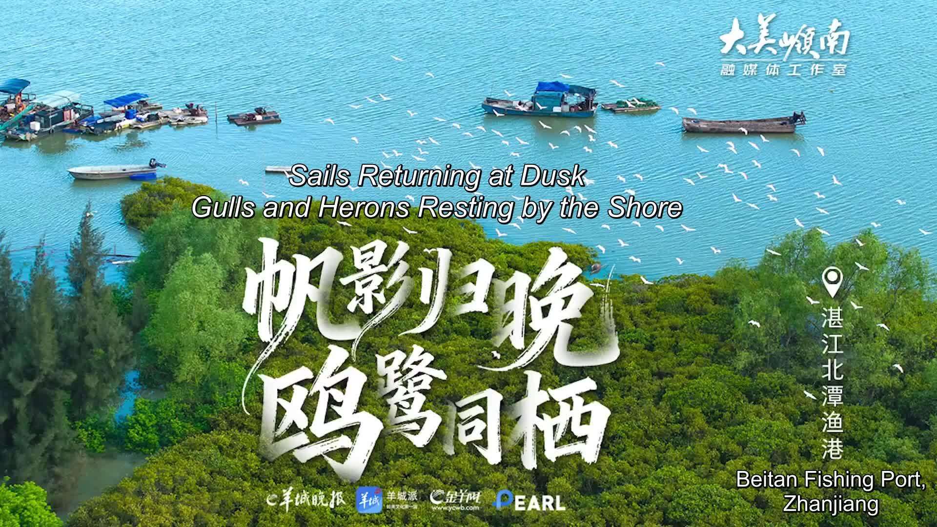 Beitan Fishing Port, Suixi, Zhanjiang: Sails Returning at Dusk, Gulls and Herons Resting by the ShoreA drone glides over the coast of the Beibu Gulf, where lush mangroves shimmer like jade along the shoreline.2025-11-11 22:09:19
 -
Look! A Race Track in Jinwan District, Zhuhai is Going Viral!The district has skillfully transformed the momentum of major events into a driving force for local development, presenting a vibrant new picture of urban-rural progress powered by sports.2025-11-11 22:09:12