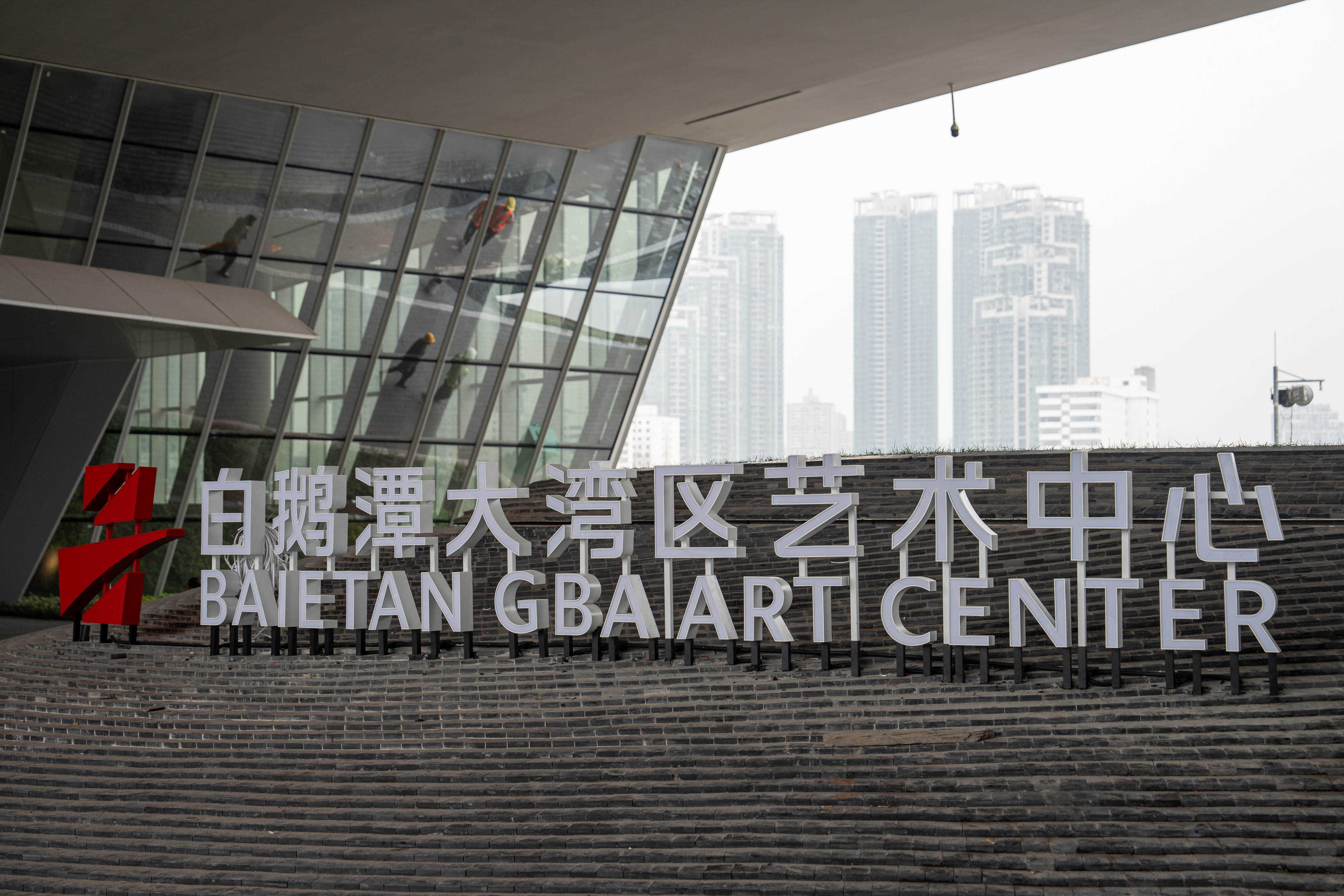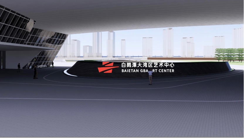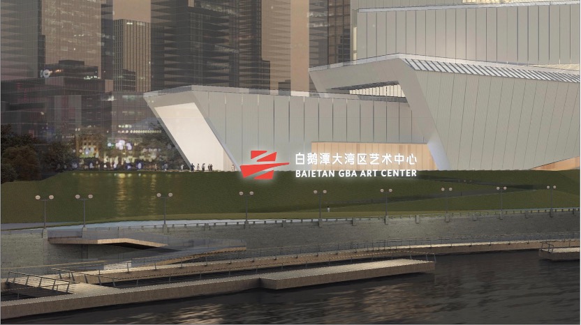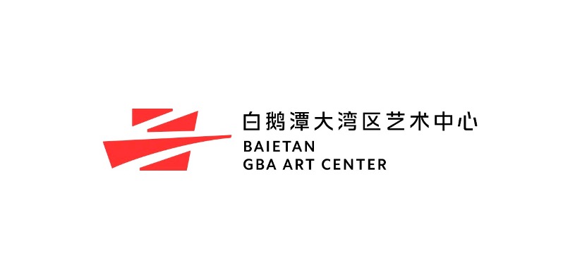
Recently, as the the Bai'etan Greater Bay Area Art Center is about to open, its official logo has been unveiled.

The overall design concept of the logo is "jointly developing a cultured bay area, lighting up life with art", with Kan Tai-keung, an international graphic design master and honorary professor of the Hong Kong Polytechnic University, serving as the artistic advisor. The design team includes Xu Lixian, the 8th chairman of the Shenzhen Graphic Design Association, and Hong Ko, a member and vice chairman of the Hong Kong Designers Association, as well as Lin Yuzhi, vice chairman of the Shenzhen Interior Design Association."
According to the design proposal, the logo is inspired by "convergence of three rivers," "connection of three regions," "integration of three museums," and "connection of eras."

To express the goal of integrating and developing the culture of Guangdong, Hong Kong, and Macao, and co-building a cultured bay area, the graphic design skillfully integrates the shapes of the Chinese characters "艺(art)" and "粤(Guangdong)", , which suggests that the Bai'etan GBA Art Center, like a giant ship carrying culture, sets sail to represent the cultural achievements of the Greater Bay Area to the world and serve as a bridge connecting cultures worldwide.
The logo consists of four red blocks, exuding a dynamic and stylish yet simple and distinct aesthetic. It creates a striking contrast with the white architecture of the Bai'etan GBA Art Center and its surrounding environment, instantly catching the eye and symbolizing the idea of "lighting up life with art".
The distinctive red color also embodies the spirit of the times and the innovative and enterprising outlook of the cities in the Greater Bay Area, and demonstrates the new outlook, atmosphere, and vitality of cultural prosperity in the Greater Bay Area.
What's so special about the four red color blocks? We can learn more from the three hidden "threes" within the logo.
In its architectural form, the logo embodies the convergence of the three rivers into the Pearl River. The location of the color blocks aligns with the former, middle, and western waterways of the Pearl River in Guangzhou, pointing towards the unique convergence point of the three rivers. The gentle flow of the Pearl River infuses vitality into the waterways, constructing a bridge reminiscent of flowing water.

The convergence of forms merges the epitome of history with the prospect of the future. Bai'etan was once a prosperous port along the Maritime Silk Road, serving as a super-hub for trade between the East and the West, which contributed to the splendor of Thirteen Hongs of Canton. Nowadays, with the connection of the "Bridge of the Times," the public can look back at the city's history, experience innovative creativity, and envision a bright future. The geographical layout symbolizes the unity of three regions with blocks representing Guangdong, Hong Kong, and Macao respectively. The Bai'etan GBA Art Center will not only rise as a new cultural landmark for the Bai'etan district but also guide the cultural development of the entire Greater Bay Area, becoming a new cultural beacon for the region, serving as a bridge linking cities, regions, and the international community.
Meanwhile, the logo's design forms a unique combination of the Chinese characters "艺" and "粤". "艺" represents the fusion of art within the Greater Bay Area, where cultural exchanges converge between different regions and internationally. "粤" signifies the central location of the Bai'etan GBA Art Center in the heart of Guangdong's provincial capital, symbolizing the core of the city where the venue is situated.

In addition, the venue distribution presents a "three-in-one" concept. The three red blocks respectively represent the Guangdong Museum of Art, Guangdong Intangible Cultural Heritage Exhibition Center, and Guangdong Museum of Literature, connected by bridges to achieve the "three-in-one" layout. This linkage allows traditional Lingnan culture to merge with contemporary culture, facilitating the mutual integration of Chinese culture with global culture, and injecting more cultural vitality into the future development of the Greater Bay Area.
Source :Yangcheng Evening News
白鹅潭大湾区艺术中心Logo抢鲜看:四个红色块竟有如此多讲究
近日,白鹅潭大湾区艺术中心开馆在即,其标识形象正式亮相。
Logo整体设计创意为“共建人文湾区,用艺术点亮生活”,由国际平面设计大师、香港理工大学荣誉教授靳埭强担任艺术顾问,深圳市平面设计协会第八届主席许礼贤,香港设计师协会会员、副会长高少康,深圳市室内设计协会副会长林语之等人参与设计。
据设计方案介绍,Logo以“三江交汇”“三地相连”“三馆合一”“时代联结”为创意。
图形设计巧妙融合汉字“艺”“粤”的形态,表达粤港澳文化融合发展、共建人文湾区的目标,寓意白鹅潭艺术中心像一艘文化巨轮扬帆出海,将承担链接世界、向世界展示粤港澳大湾区文化成就的使命担当。
Logo由四个红色色块构成,动感时尚、简洁鲜明,与白鹅潭大湾区艺术中心主体白色建筑及周边环境形成鲜明对比,让人眼前一亮,寓意“用艺术点亮生活”。
鲜明的红色也表现粤港澳大湾区城市的时代精神和创新、进取的风貌,展现粤港澳大湾区文化繁荣发展的新面貌新气象新活力。
四个红色色块竟有如此“讲究”?不妨从Logo中隐藏的三个“三”了解更多细节。
建筑外形上呈现“三江交汇”。色块位置与广州市前航道、后航道与西航道相符合,朝向所指处为三江的唯一交汇点。珠水缓缓流淌,注入水脉的生命力,搭建一座如同水构建的桥。
形态的交汇将历史的缩影与未来的前景融为一体。白鹅潭曾是海上丝绸之路的繁荣港口,也是连接东西方贸易的超级枢纽,成就了广州十三行的辉煌。如今,以时代之桥相连,公众得以回望城市历史,感受先锋创想,展望美好未来。
地理位置上呈现“三地相连”。不同色块分别代表了粤、港、澳三地。白鹅潭大湾区艺术中心不仅将崛起成为白鹅潭的全新文化地标,也将引领整个大湾区的文化发展,成为新的大湾区新文化地标,作为联结城市、城市与区域,区域与国际的桥梁。
同时,标识形象构成独特的“艺”字和“粤”字型。“艺”代表着大湾区艺术融合,不同地区与国际之间文化交流汇聚。“粤”代表着白鹅潭大湾区艺术中心坐落在广东省会的城市中心,象征着场馆所在城市的核心。
场馆分布上呈现“三馆合一”。三个色块分别代表广东美术馆、广东省非物质文化遗产馆和广东文学馆,以桥相联,“三馆合一”。让传统岭南文化与当代文化得以联结,中国文化与世界文化相互共融,为湾区未来的发展注入更多的文化活力。
策划 | 陈桥生 林洁
统筹 | 邓琼 侯恕望 黄建隽
执行统筹 | 朱绍杰 麦宇恒 尹锋峰
文 | 记者 梁善茵 朱绍杰
图 | 场馆相关方提供
译 | 肖凯欣
-
Ticket giveaways | Encounter Marco Polo, explore Guangdong
2024-04-26 23:45:34 -
Top ten intangible cultural heritage categories showcased at Canton Tower
2024-04-25 23:45:43 -
Over 10 mn people tune in to CCTV for "My Life in Books"
2024-04-25 23:42:48 -
I SEE CHINA | Serbian international student's impression on Canton Fair: promoting business and friendship
2024-04-25 23:43:44


